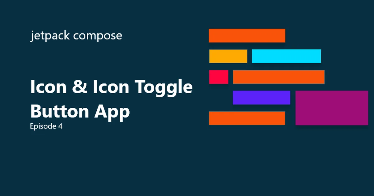
The article provides a detailed guide on using various button types in Jetpack Compose, including Button, IconButton, and ToggleButton, along with best practices for different use cases such as primary actions, secondary actions, and icon-only interactions. It emphasizes the importance of accessibility by recommending content descriptions for icons and combining icons with text for clarity. Content creators should focus on selecting appropriate button types to ensure consistency and usability in their applications.
Read the full article at DEV Community
Want to create content about this topic? Use Nemati AI tools to generate articles, social posts, and more.
9
Comments
Tags
AN
Ali NematiWritten by Ali