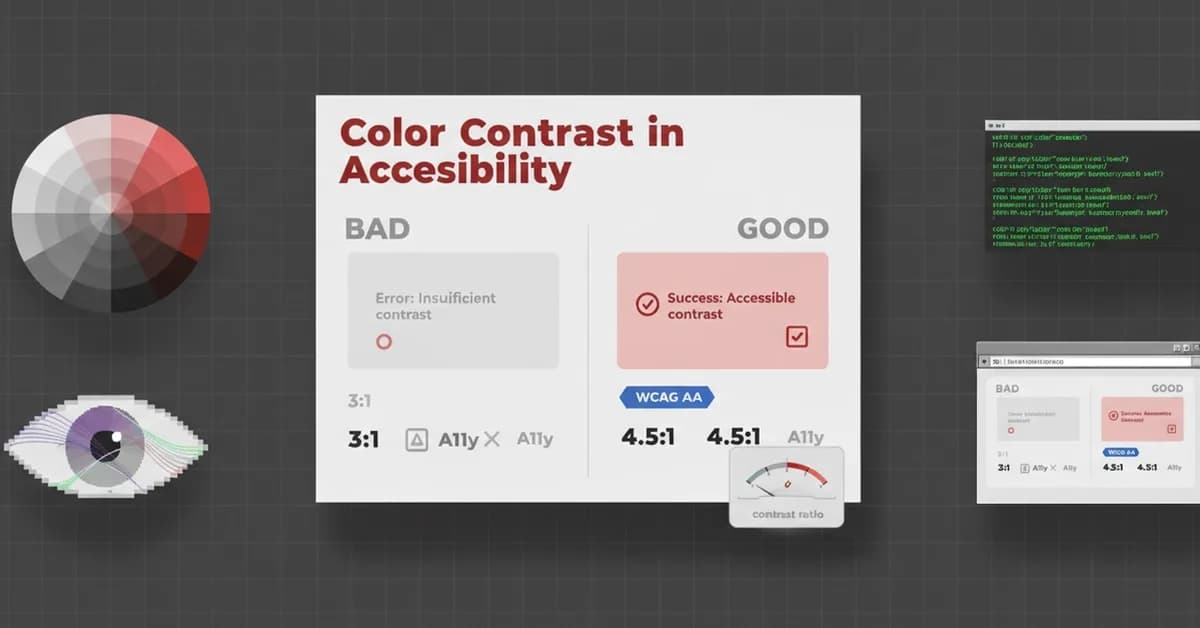
Color alone should not be used to convey critical information, as users with color blindness or in bright sunlight may struggle to perceive it. Adhering to WCAG AA standards requires a minimum contrast ratio of 4.5:1 for normal text and 3:1 for large text to ensure readability. Implementing alternative visual cues like icons and distinct text colors is crucial for accessible design, and tools like axe DevTools can aid in verification.
Read the full article at DEV Community
Want to create content about this topic? Use Nemati AI tools to generate articles, social posts, and more.
Views28
Tags

Ali NematiBlogUI.author_articles